MSA - Digital platform for music sharing.
Project Duration: June 2023 - July 2023
Role: UX Designer
Overview:
Music Sharing App is a digital platform designed to enable users to upload, discover, and stream music. Users can explore music by various artists, create personalized playlists, and share their favorite tracks with their community.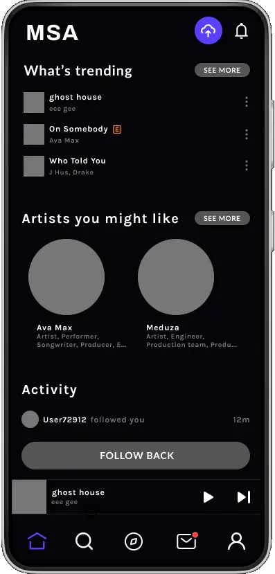
The Problem:
Despite the rise in popularity of music streaming apps, there is still a gap in the market for a platform that allows users to easily share their music with others. The project's objective was to develop a user-friendly interface that bridges this gap, offering an enjoyable music sharing experience.The goal:
To design a user-friendly interface for uploading and streaming music, incorporate social features for sharing and discovering music within the user community, and to ensure the platform is inclusive and accessible to all users, including those with disabilities.User Research
In my initial research phase for the Music Sharing App, I conducted comprehensive user research through interviews, surveys, and competitor analysis, which validate my initial assumption that users found the music upload process on streaming platforms to be difficult and confusing, and that discovering new music was a challenge, but also brought to light new areas of improvement. Users expressed a strong desire for a straightforward and user-friendly interface, citing Spotify as a model for clean design and intuitive navigation, and mentioning that platforms like SoundCloud and Bandcamp often lead to confusion due to their cluttered and complex user interfaces. This valuable user feedback directed my design philosophy towards creating a simplified and engaging user experience- Complex Upload Process: Users found the process of uploading their music tracks on existing platforms to be quite complicated and time-consuming, and often found themselves lost in the multi-step procedures.
- Confusing Navigation: Users reported that navigating through platforms like SoundCloud and Bandcamp was confusing. They often struggled to find the functionalities they were looking for, leading to frustration and decreased usage over time.
- Music Discovery: The users found it hard to discover new music or new artists. The existing systems did not offer a user-friendly way to explore and discover new music based on their preferences.
- Interface Overwhelm: Users mentioned that the interfaces of some platforms are overwhelming, cluttered, and lack intuitiveness. This made it hard for them to engage with the platform and manage their music effectively
Pain Points:
Persona: Amateur Ashley
Problem statement: Ashley is an amateur musician who needs a platform to share her music and receive feedback because she wants to improve her skills and gain recognition.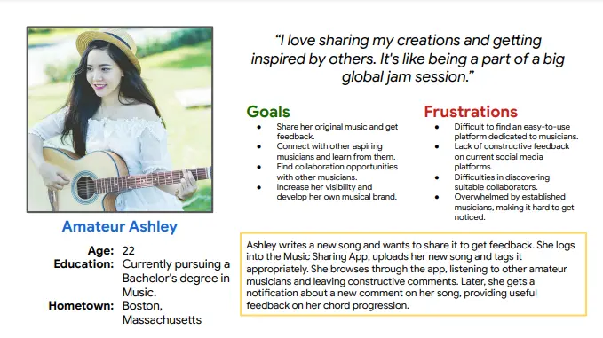
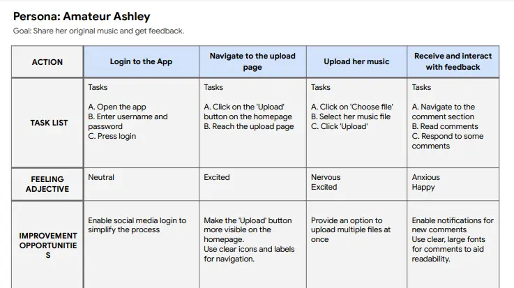
User Journey Map
Paper Wireframes
Drafting paper wireframes in the initial stages of design allowed me to experiment with different layouts and interface elements quickly. This low-fidelity method kept my focus on usability and function, rather than aesthetics and became an effective tool for validating my design concepts before investing time and resources into higher-fidelity prototypes.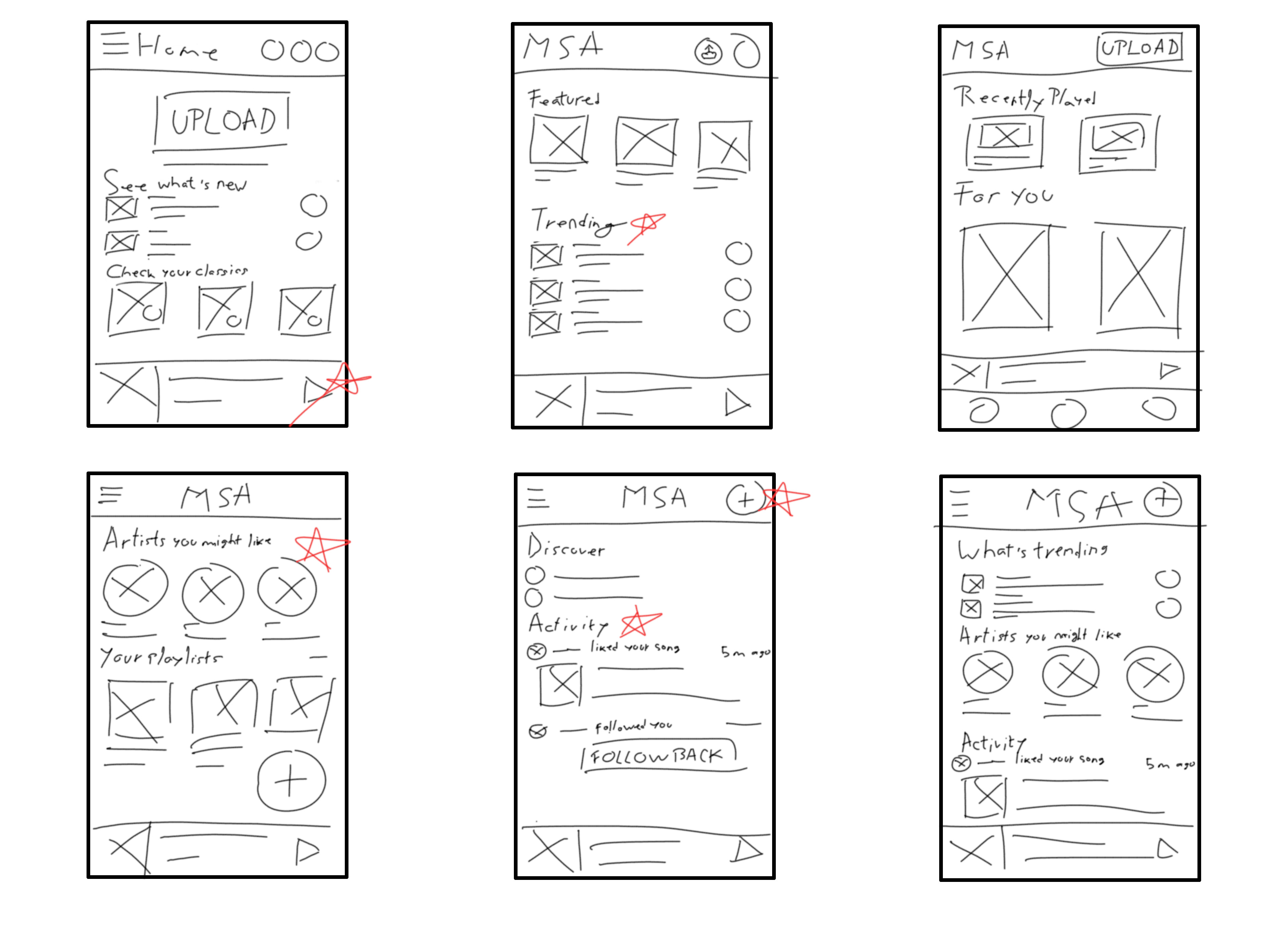
Digital Wireframes
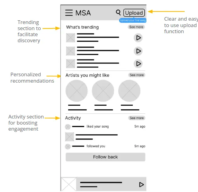
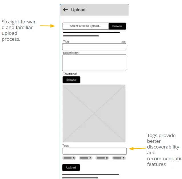
Low-Fidelity Prototype
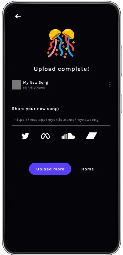
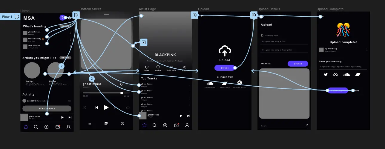
The user flow was designed to be as seamless and intuitive as possible. Starting from the home screen, the user might play a song, go to an artist’s page, or upload a new song. After filling in the details of the song, the user is congratulated.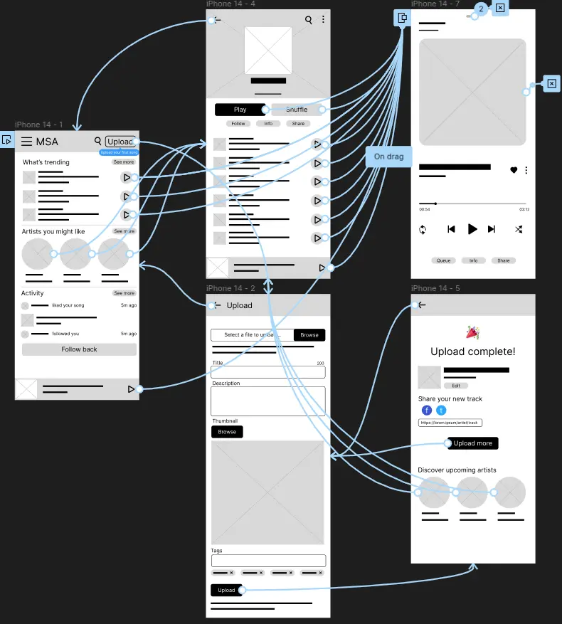
Usability Studies
To gain a better understanding of these issues and improve user experience, I decided to conduct 2 rounds of usability studies. My aim was to identify usability issues and areas of improvement by observing real users as they interacted with the prototype and completed key tasks
Round 1 findings
- Users found the upload process simple
- Users found the app functionally unclear
- Interface was not pretty
Round 2 findings
- Some features were hard to discover
- Some users found the upload screen cluttered
Mockups
Contrary to the initial expectations, the usability study revealed that users found the interface less attractive than anticipated, and the navigation was not as intuitive as designed. Some users mentioned that the overall aesthetics of the app did not align with their expectations for a modern music sharing app. These significant insights highlighted the areas of improvement for the next design iteration.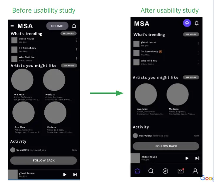
New issues emerged regarding the music upload process, as users found it complex and time-consuming. Several users expressed the desire for a simplified and streamlined UI.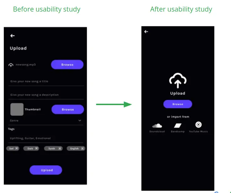
High-Fidelity Prototype
Accessibility considerations
- I have ensured that the color contrast on all pages meets the WCAG 2.1 guidelines for text and background colors. This assists users with color vision deficiencies or other visual impairments in reading and understanding content.
- The font sizes and weights have been carefully chosen to be readable for people with visual impairments.
- The size of touch targets (buttons, icons, links, etc.) are large enough to accommodate different hand sizes and precision levels, which is especially useful for users with motor impairments.
Impact:
The peer reviews and responses from the test participants were overwhelmingly positive. The redesigned user interface, improved navigation, and attention to accessibility have created a music sharing app that stands out. Even without quantifiable metrics like downloads or sign-ups, the design's impact is evident from the positive responses and feedback received.
What I learned:
Throughout this project, I learned the importance of user-centric design and iterative processes. Understanding user needs, pain points, and behaviors through research was instrumental in shaping my design decisions. It revealed that simplicity and ease of use were paramount for our users, and addressing their pain points could lead to a significantly improved user experience.
Next Steps:
- Further user testing with a wider range of participants, including more people with different types of impairments to further improve the app's accessibility.
- Implement a feedback feature within the app to continuously gather user opinions. This would be an ongoing source of real-time user insights, helping us improve and evolve the app according to users' changing needs and preferences.
- Building more features that could enhance user experience, like personalized music recommendations, a more dynamic social sharing feature, and multi-language support to make the app even more inclusive.