SafeSpace
Domestic abuse support app disguised as a to-do list
Project Duration: June 2023 - July 2023
Role: UX Designer
Overview:
SafeSpace is a covert support platform disguised as a to-do list app, providing accessible resources and aid for individuals experiencing domestic violence. The application is designed for those living in abusive situations who require discrete access to support and information, fostering safety and empowerment.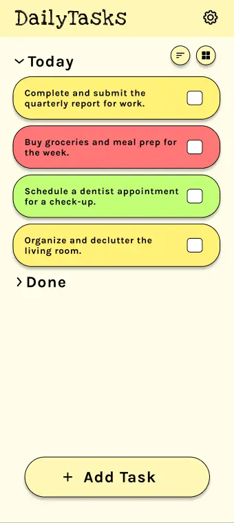
The Problem:
My goal was to address the challenge of safely providing resources and assistance to those in abusive situations, recognizing the critical need for discretion and easily accessible information.
The goal:
The aim of this project was to design a user-friendly, intuitive application that ensures safety and discretion while offering immediate support. Through SafeSpace, I strive to drive positive change by empowering individuals with information and resources, ultimately contributing to the fight against domestic violence.
User Research
I began my user research with secondary data analysis, online surveys, and professional interviews, originally assuming most users would be women and prefer phone support. However, my findings highlighted a significant number of men, particularly from the LGBTQ+ community, who were seeking domestic violence support, and varied levels of tech-access and digital literacy. Surprisingly, I found many users, particularly younger ones, were comfortable using digital platforms to seek help, as long as privacy and discretion were assured.
Persona 1: Sarah
Problem statement: Sarah is a mother and nurse living in a suburban neighborhood who is experiencing emotional and physical abuse from her husband. She needs a discrete, accessible platform to seek help, understand her legal rights, and connect with others experiencing similar situations because she has limited privacy, is unsure about available resources, and fears retaliation from her abuser.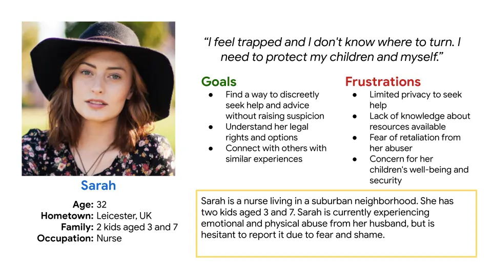
Persona 2: Alex
Problem statement: Alex is a city-based graphic designer in a same-sex relationship, unsure if he's a victim of domestic abuse. He needs reliable information about domestic violence, anonymous professional help, and support from people with similar experiences because he is challenged by societal stereotypes, fears of being judged or misunderstood, and is uncertain about where to find appropriate help.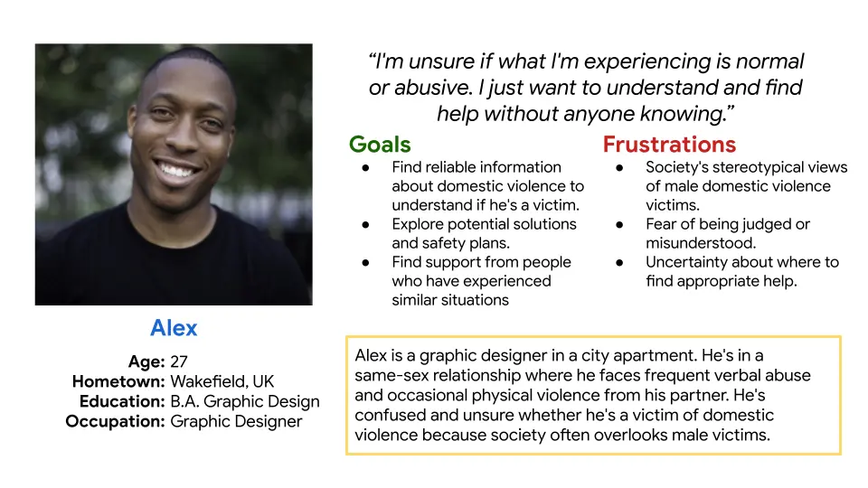
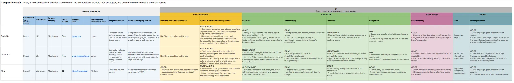
Competitive Audit
While Bright Sky and DocuSAFE Evidence Collection are designed to provide support to individuals facing domestic violence or personal safety issues, they face significant challenges related to user experience, functionality, and reliability, potentially limiting their effectiveness during crisis situations.
Paper Wireframes
Drafting paper wireframes in the initial stages of design allowed me to explore different layouts and quickly, saving me time and resources.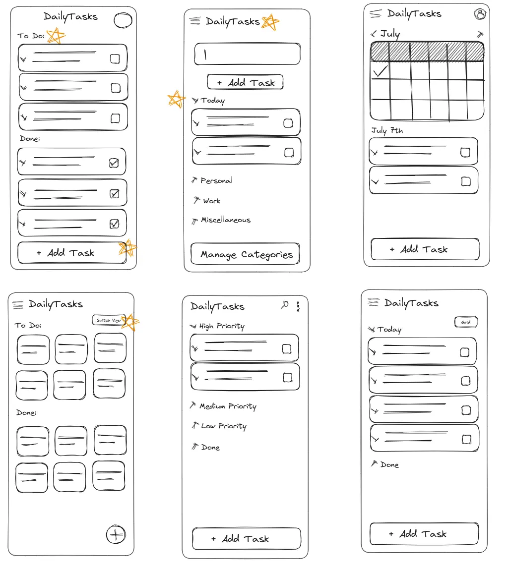
Digital Wireframes
In keeping with the disguised nature of SafeSpace, the settings menu should appear as typical as possible while still providing the pathway to access the app's true resources.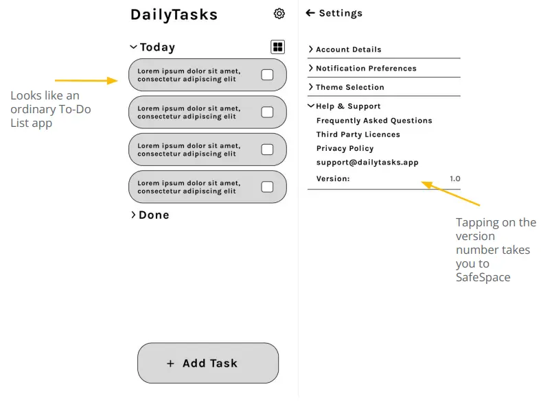
Low-Fidelity Prototype
The low-fidelity prototype laid out the structure of the app, serving as a roadmap for its design and functionality, while also providing a foundation to gather initial user feedback and iterate on the design.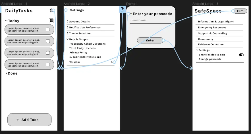
Usability Studies
My usability study revealed crucial insights about the need for more intuitive access to SafeSpace, prominence of safety features, visual accessibility improvements, and the effectiveness of our initial app disguise, leading to significant iterations for an enhanced user experience.
Discoverability of SafeSpace:
The most common theme among the participants was the difficulty in finding the access point to SafeSpace within the settings. Though some participants appreciated the discrete placement, others found it frustrating and non-intuitive.
Visibility and Accessibility of Safety Features
Concerns were raised about the visibility of the quick-exit feature and the app's privacy policy.
Understanding the Initial Interface
The to-do list disguise was effective as all participants initially perceived the app as a regular task management tool.
Mockups
Post usability study, I optimized visual accessibility by using larger fonts, high contrast colors for readability and clarity, and an uncluttered design, ensuring SafeSpace's critical features remain accessible and prominent while still discrete.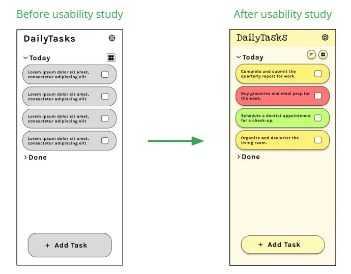
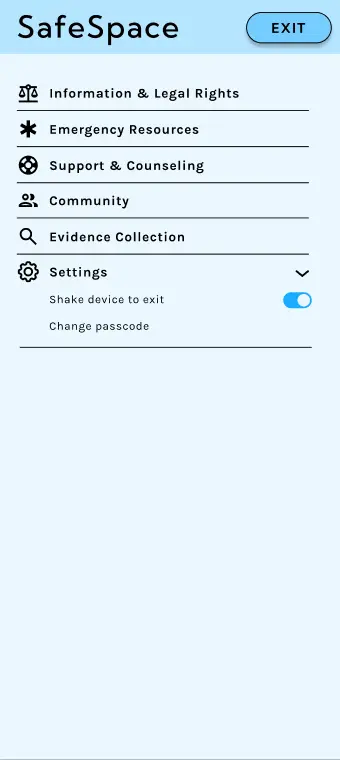
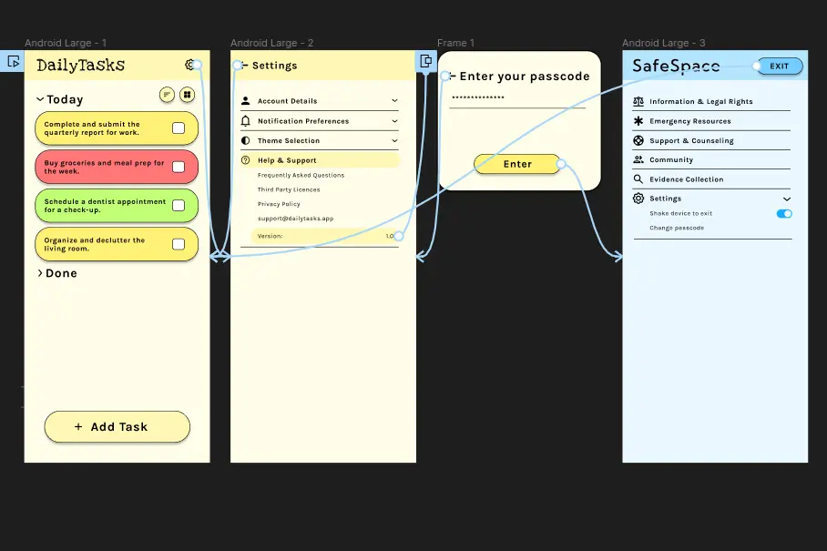
In the high-fidelity prototype, users begin with an everyday task list, navigate to a subtly highlighted settings section, and access SafeSpace, where they can quickly reach emergency contacts, access legal information, find support and counseling resources, and connect with community stories, all with the safety of a quick-exit feature.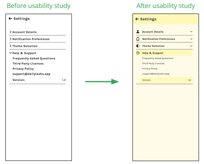
High-Fidelity Prototype
Sitemap
The sitemap was designed to balance the disguise of a regular task management app with the hidden yet easily navigable SafeSpace, aiming to provide users a seamless journey from everyday tasks to accessing critical support resources, ensuring discretion and user-friendly navigation throughout.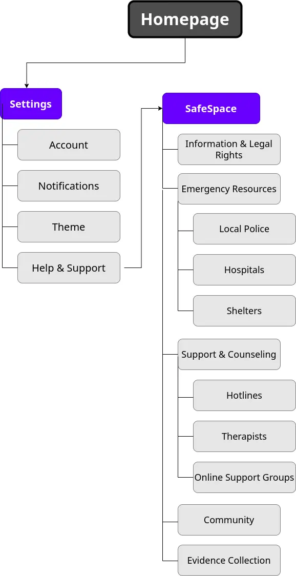
Accessibility considerations
- I improved visual accessibility by using larger font sizes, clear labeling, and a high contrast color scheme, making text and important features easier to read and identify, even under stressful situations.
- I considered navigational accessibility by maintaining a simple, intuitive layout for the SafeSpace interface, enabling users to locate and use important features quickly and efficiently.
- To ensure content accessibility, I organized resource information into distinct, easy-to-navigate sections, and included a search feature for quicker access to specific resources, making the wealth of information more manageable and user-friendly.
Impact:
While still in the early stages to provide quantitative data, one study participant shared, "This feels like a lifeline, hidden in plain sight." This feedback reaffirms my goal to create a positive, potentially life-changing impact for users in need.
What I learned:
Throughout this project, I learned the critical importance of user-centered design in creating a discrete yet accessible platform, and how iterative feedback and careful attention to accessibility can significantly improve the usability and effectiveness of a tool aimed at aiding individuals in sensitive and challenging circumstances.
Next Steps:
- Post iterations, I plan to conduct additional usability studies with a diverse set of users. This is to validate the improvements made and ensure that SafeSpace meets the needs of a broad range of individuals experiencing domestic violence.
- I plan to incorporate localization of resources, tailoring information to the user's specific geographical location. This will make the resources more relevant and immediately useful to our users.
- As user needs and technology evolve, I aim to continuously iterate and improve SafeSpace. Regular updates and feature additions are planned to ensure the app stays relevant and continues to effectively empower and aid those in need.